Tripleopolis Microsite Nominated for Site of the Day Award
Sep 25, 2024
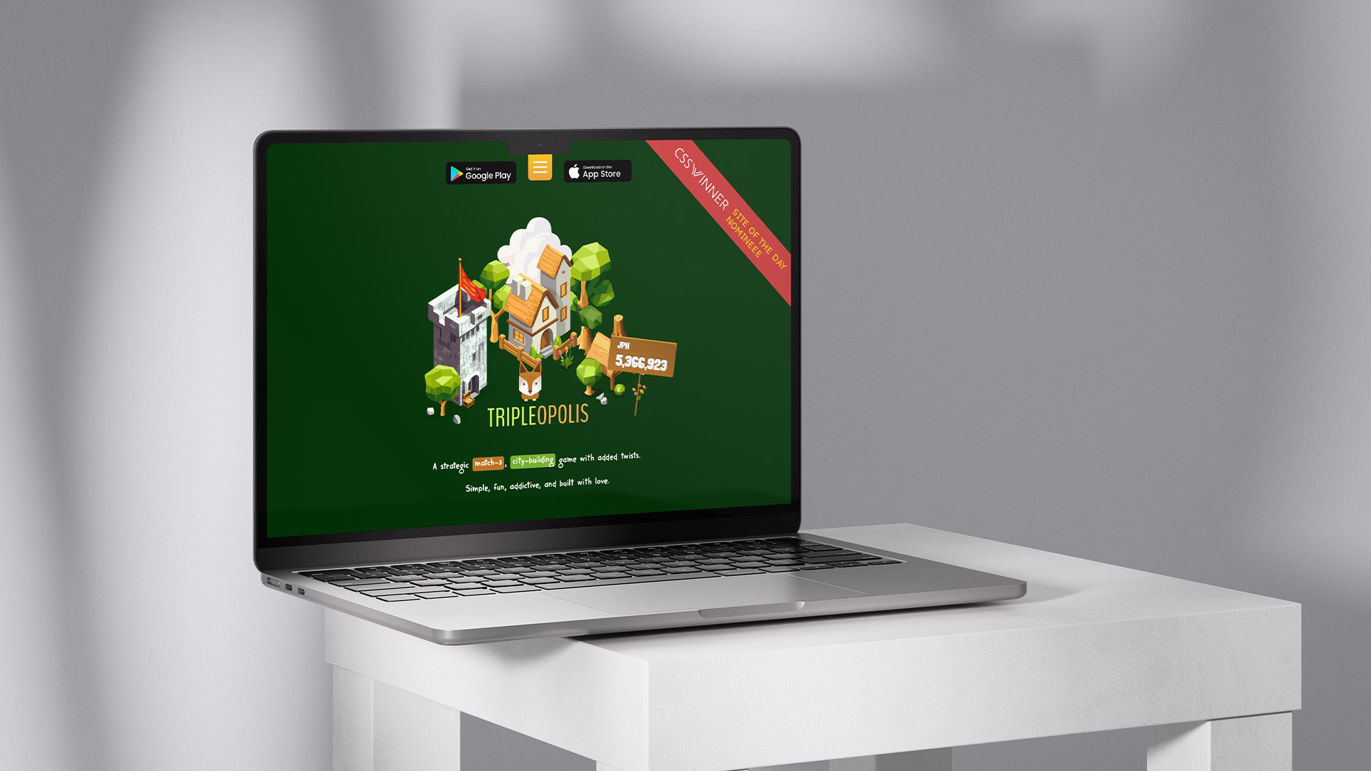
The microsite for Tripleopolis, my debut game, has been nominated for CSS Winner’s Site of the Day. It’s great to see the site recognised in a global contest, particularly as it showcases both design and development aspects.
For those unfamiliar, Tripleopolis is my first mobile game, available on iPhone and Android. The microsite was designed to offer players and visitors a visual experience of the game’s world, incorporating gameplay aspects and even the live high scores.
The Design Approach
In designing the Tripleopolis microsite, my aim was to make the site as visually engaging as the game itself. By incorporating in-game assets and artwork, I aimed to create a cohesive experience, drawing users into the world of Tripleopolis from the moment they arrive.
Key aspects of the design include:
– Game-inspired visuals that mirror the look and feel of the app.
– Fluid animations and transitions to guide users seamlessly through the content.
– A responsive layout to ensure a consistent experience across both mobile and desktop.
– Bringing the Site to Life with GSAP
– To achieve smooth, interactive animations, I used GSAP (GreenSock Animation Platform). GSAP allowed me to build animations that felt fluid and natural without compromising on performance. The goal was for the animations to enhance the experience without overwhelming it.
Some of the animation highlights include:
– Scroll-triggered transitions, creating a sense of progression as users navigate the site.
– Micro-interactions such as hover effects and clickable icons that subtly respond to user input.
– Parallax scrolling to add depth and immersion to the visuals.
Challenges and Considerations
A key challenge was ensuring performance across different devices, particularly on mobile. The animations had to feel smooth without causing long load times, so I spent considerable time optimizing how assets loaded and how animations were handled behind the scenes.
Another important aspect was maintaining usability. While it’s easy to go overboard with animations, I wanted to ensure the experience remained clear and enjoyable for all visitors, regardless of their familiarity with the game. Striking that balance between creativity and usability took some careful fine-tuning.
Looking Ahead
I’m incredibly proud of the Tripleopolis microsite and what it represents, both as a promotional piece for the game and as a standalone project. This nomination from CSS Winner is a nice little nod of recognition for the hard work that went into it.
If you’ve not downloaded Tripleopolis yet what are you waiing for… it’s available for free on boh Android and iPhone.